
| 일 | 월 | 화 | 수 | 목 | 금 | 토 |
|---|---|---|---|---|---|---|
| 1 | 2 | 3 | ||||
| 4 | 5 | 6 | 7 | 8 | 9 | 10 |
| 11 | 12 | 13 | 14 | 15 | 16 | 17 |
| 18 | 19 | 20 | 21 | 22 | 23 | 24 |
| 25 | 26 | 27 | 28 | 29 | 30 | 31 |
- codepush
- xlsx-js-style
- code-push-standalone
- javascript
- 코드푸시
- reactnative
- 글또10기x코드트리
- supabase 페이지네이션
- set
- app.post
- 상속
- 스크롤이벤트
- Spring
- 타입스크립트
- Next.js
- meatadata
- Filter
- react
- supabase authentication
- TS
- supabase auth
- 이진탐색
- interface
- map
- 페이지네이션
- generic
- async
- 슬라이딩윈도우
- array
- extends
- Today
- Total
rhanziy
React - Swiper 라이브러리 Center overlap 현상, slide width 조절 본문
Swiper Demos
Swiper is the most modern free mobile touch slider with hardware accelerated transitions and amazing native behavior.
swiperjs.com
시작해볼까.
$ npm install swiper
만들고싶었던 UI형태는 이렇다.
센터가 고정되면서 슬라이드되는 카드
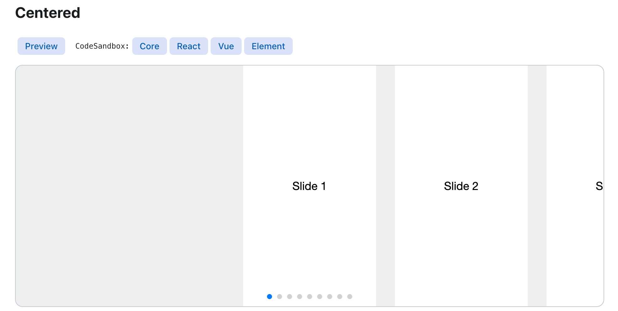
공식문서에서 제공하고있는 React 코드를 보면, (다른 말이지만 코드샌드박스 진짜 안열린다 개빢침)
import { Pagination } from "swiper/modules";
import { Swiper, SwiperSlide } from "swiper/react";
import "swiper/css";
import "swiper/css/pagination";


export const SlideComponent = () => {
  return (
    <Swiper
      slidesPerView={"auto"}
      spaceBetween={30}
      centeredSlides={true}
      pagination={{
        clickable: true,
      }}
      modules={[Pagination]}
      className="mySwiper"
    >
      <SwiperSlide>
        <Box width={"280px"} height={"300px"} bgcolor={"red"}>
          1
        </Box>
      </SwiperSlide>
      <SwiperSlide>
        <Box width={"280px"} height={"300px"} bgcolor={"yellow"}>
          2
        </Box>
      </SwiperSlide>
      <SwiperSlide>
        <Box width={"280px"} height={"300px"} bgcolor={"blue"}>
          3
        </Box>
      </SwiperSlide>
      <SwiperSlide>
        <Box width={"280px"} height={"300px"} bgcolor={"green"}>
          4
        </Box>
      </SwiperSlide>
    </Swiper>


    ...
이런식으로 사용한다. SwiperSlide 안에 보여줄 컨텐츠를 넣기.
pagination이나 navigation을 추가하려면 swiper/modules 에서 가져오면 되는데, 중요한건 css 도 import 해줘야 된다.
여기서 끝인줄 알았으나, 원하는대로 화면에 뜨지 않았다능.

pagination bullet도 컨텐츠 안에 있고, center card 도 아니고 다음카드가 미리 보여지지도 않았다.
pagination bullet은 swiper wapper padding으로 조절해주자 ㅋ
const CustomSwiper = styled(Swiper)({
  ".swiper-pagination-bullet-active": {
    background: "#9C65FF",
  },
});

export const ScrollJoinProcess = () => {
  return (
    <CustomSwiper
      slidesPerView={"auto"}
      spaceBetween={30}
      centeredSlides={true}
      pagination={{
        clickable: true,
      }}
      modules={[Pagination]}
      className="mySwiper"
      style={{
        paddingTop: "60px",
        paddingBottom: "80px",
      }}
    >

    ... 생략
    </CustomSwiper>
스타일은 emotion 과 mui 로 작업하고있어서 CustomSwiper라는 스타일컴포넌트를 하나 생성해서 불릿 색을 바꿔줬고,
padding 은 그냥 style태그를 추가해서 조절해줬다.

ㅇㅇ 확실히 넓어지긴했지 근데 원하는건 이게아니야.....
SwiperSlide width 문제인가 해서 width도 줘보고 margin도 줘보고 !important도 줘보고... 스택오버플로우 구글링, 개발자모드 css수정 총 동원해서 해봤는데요.....방법은 넘나 간단했던 것..
<SwiperSlide style={{ width: "fit-content" }}>
width 를 fit-content 해주면 됐다.

전체코드쓰.
import { Box } from "@mui/material";
import React from "react";

import { Pagination } from "swiper/modules";
import { Swiper, SwiperSlide } from "swiper/react";
import "swiper/css";
import "swiper/css/pagination";
import styled from "@emotion/styled";

const CustomSwiper = styled(Swiper)({
  ".swiper-pagination-bullet-active": {
    background: "#9C65FF",
  },
});

export const ScrollJoinProcess = () => {
  return (
    <CustomSwiper
      slidesPerView={"auto"}
      spaceBetween={30}
      centeredSlides={true}
      pagination={{
        clickable: true,
      }}
      modules={[Pagination]}
      className="mySwiper"
      style={{
        paddingTop: "60px",
        paddingBottom: "80px",
      }}
    >
      <SwiperSlide style={{ width: "fit-content" }}>
        <Box width={"280px"} height={"300px"} bgcolor={"red"}>
          1
        </Box>
      </SwiperSlide>
      <SwiperSlide style={{ width: "fit-content" }}>
        <Box width={"280px"} height={"300px"} bgcolor={"yellow"}>
          2
        </Box>
      </SwiperSlide>
      <SwiperSlide style={{ width: "fit-content" }}>
        <Box width={"280px"} height={"300px"} bgcolor={"blue"}>
          3
        </Box>
      </SwiperSlide>
      <SwiperSlide style={{ width: "fit-content" }}>
        <Box width={"280px"} height={"300px"} bgcolor={"green"}>
          4
        </Box>
      </SwiperSlide>
    </CustomSwiper>
  );
};'React' 카테고리의 다른 글
| React - xlsx-js-style 라이브러리로 엑셀 다운로드 구현하기 (2) | 2025.01.03 |
|---|---|
| React - styled component 여러가지 예제 (0) | 2023.03.22 |
| React - image file 업로드 및 preview 구현 (0) | 2023.02.09 |
| React - 리액트 라우터 v6 설치, 사용(useNavigate, nested routes, useParams까지) (0) | 2022.12.09 |
| React - 실시간 데이터 전송이 필요할 때 react-query 라이브러리 (0) | 2022.12.06 |